skip to main |
skip to sidebar
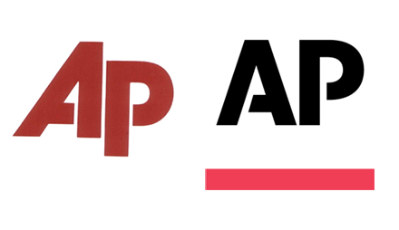
The Associated Press has a new logo -- its first in 30 years! -- and it looks much more upright instead of slanting off to the right as the old one did. It's also black, with a red underline, and the stencil-like look that's a little more pronounced, with larger bridges in the letters -- the bridge on the "A" also shifted from right to left. According to the AP's marketing package (PDF), the straight-up letters are supposed to send the message that AP leans over for nobody. The revised logo "is bold and straightforward and stands upright to stress integrity." Meanwhile, the new color scheme "shows the dynamic nature of our news company, and allows a much-needed flexibility to reflect our diverse array of products and services." (via)
i don't know.


4 comments:
red and black is a disgusting color scheme.
i think it looked better before.
why is the AP floating so high above the red bar?
it's a hidden message by the elitist liberal media joel. they don't lean over for anybody, but they think of themselves as high above the red states.
in that case i approve.
Post a Comment