
Showing posts with label logo. Show all posts
Showing posts with label logo. Show all posts
24 May 2016
"if a logo gets changed in the forest and no one is there to see it..."
michael beirut and jessica helfand discussing the new instagram logo and other stuff.
14 April 2015

12 March 2015
this is fascinating.

the lady vols, however, object. and it's mixing up my feelings about feminism and gender-quality and brand strategy and pat summitt.
On Nov. 10, 2014 the university announced plans to transition all men’s and women’s athletic teams under the “Power T.” The decision coincided with a dual-rebrand between academics and athletics that would make the “Power T” the universal logo for the University of Tennessee, not just its athletic department. Under the new plan, which coincides with a shift from Adidas to Nike in athletic apparel, all sports programs except women’s basketball will be known as “Volunteers,” the nickname that’s defined the men’s side for decades. The change will be official on July 1.
UT first formed its women’s athletic department prior to the 1976-77 academic year, and the school had separate athletic departments until 2009. During that span the Lady Vols grew into one of the most impactful women’s brands in college sports. Lady Vols teams have won 11 national championships, including eight in women’s basketball, and 68 conference titles. The basketball team is the only program to play in all 33 NCAA tournaments since the NCAA began sanctioning women’s sports in 1981-82. An average of 11,038 fans attended Lady Vols home basketball games during the 2013-14 season, the highest average in the country.
But that success hasn’t been relegated to basketball. The Lady Vols softball team has reached six Women’s College World Series in the last 10 years. The women’s swim team has finished in the top 15 at the NCAA Championships in a school-record nine consecutive seasons. Tennessee won two women’s indoor track and field national championships (2005, 2009) within the last decade. That’s why many former student-athletes view the Lady Vols decision as a blow to a historic brand.
“Former Lady Vols always look after current Lady Vols,” Mansson said. “I got really upset because it felt like they took away my, and others’, identity.” (via)in the end, the university has decided to let only the women's basketball program retain the lady vols logo, out of respect for the program's storied success under pat summitt, which seems like the worst possible solution.
meanwhile, deadspin's trying try to find a tennessee resident to request emails between nike and the university, if anyone feels like helping...
14 January 2014
30 August 2012

15 August 2012
06 June 2012
26 April 2012
the brooklyn nets new logo

As long as I am shamelessly re-blogging, this is probs the new brooklyn nets logo. looks like bard.
i like it.
the nets had this splash page up yesterday on their website. EXCITING!
03 April 2012
13 March 2012
drag race all-stars
 this is your chance to become a part of television history.
click here
rupaul is letting us all vote on who our favorite queens are from all seasons past of drag race. then, we MIGHT see the winner of the fan poll on the drag race all stars season.
today i voted for alexis matteo, but tomorrow im going to vote for raja.
omgomgomgomgomg #dragrace
#youbettawork
#maythebestwomanwin
23 February 2012
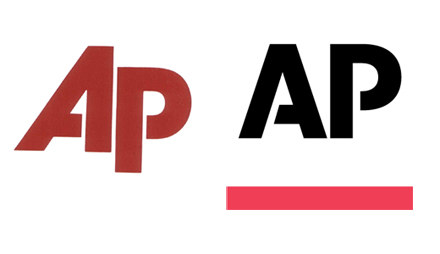
new AP logo

The Associated Press has a new logo -- its first in 30 years! -- and it looks much more upright instead of slanting off to the right as the old one did. It's also black, with a red underline, and the stencil-like look that's a little more pronounced, with larger bridges in the letters -- the bridge on the "A" also shifted from right to left. According to the AP's marketing package (PDF), the straight-up letters are supposed to send the message that AP leans over for nobody. The revised logo "is bold and straightforward and stands upright to stress integrity." Meanwhile, the new color scheme "shows the dynamic nature of our news company, and allows a much-needed flexibility to reflect our diverse array of products and services." (via)i don't know.
Subscribe to:
Comments (Atom)