The Volunteers’ power T is probably the best logo in the SEC for one reason: it’s so recognizable. The unique style of the T is unlike any other and who can forget that bright orange?

The Volunteers’ power T is probably the best logo in the SEC for one reason: it’s so recognizable. The unique style of the T is unlike any other and who can forget that bright orange?
#NOWNESSPicks: Saluting Alfred Hitchcock’s go-to graphic designer #SaulBass #cinema http://t.co/2310icZnSP pic.twitter.com/BZSTwzBRWZ
— NOWNESS (@NOWNESS) June 16, 2015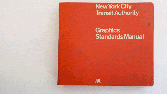
It was called the Graphics Standards Manual, and it was produced for the MTA by Massimo Vignelli and Bob Noorda, two then-unknown designers who worked at Unimark International at the time. A recent New Yorker article about the golden age of corporate identities discussed their manual as one perfect example of the era—concise, utterly practical, and incredibly prescient.
It's unclear how many of these red-covered manuals are still around, but one copy was recently rediscovered by three young designers—Hamish Smyth, Niko Skourtis and Jesse Reed—who work at the NYC graphic design giant Pentagram. As Smyth told me this week, the manual was discovered entirely by accident, as two designers rooted around in Pentagram's basement looking for something else entirely.
"They were searching the basement for a tarpaulin to cover our outdoor foosball table when they stumbled upon the manual at the bottom of a staff locker under a bunch of old gym clothes," Smyth explained. "For graphic designers, this is like stumbling on a first edition Gutenberg Bible. Well, perhaps that is a bad analogy, because graphic designers would also have a hard time containing themselves over that." (via)thx liz!


Up until that point, NASA had been primarily using an insignia adapted by James Modarelli, the head of NASA’s Lewis Research Center Reports Division. This logo, created in 1959 and affectionately dubbed “The Meatball,” relied heavily on multiple visual metaphors. According to NASA’s Web site, “the sphere represents a planet, the stars represent space, the red chevron is a wing representing aeronautics (the latest design in hypersonic wings at the time the logo was developed), and then there is an orbiting spacecraft going around the wing.” Although charming in its quirkiness, the meatball proved difficult to reproduce given the printing technology available at the time and the variety of applications it would need to adorn.
Enter Richard Danne and Bruce Blackburn. They were hired to create, in Danne’s words, “a more useful new Logotype.” In a recently completed, yet to be published memoir, Danne describes the streamlined new design as “clean, progressive, could be read from a mile away, and was easy to use in all mediums.” Danne and Blackburn replaced the complex meatball with a stripped-down, modernist interpretation where even the cross stroke of the A’s were removed.
...
Seventeen years later, despite its winning the prestigious “Award of Design Excellence” by The Presidential Design Awards, NASA scrapped the Danne and Blackburn design and re-instated “The Meatball.” Danne thinks this was at least partly due to how NASA chose to introduce the new logo to its various internal agencies in the first place. He says the redesign was kept secret until letters were set out to every center director … on their new stationery. Those loyal to the old design were offended, and a rivalry between “The Meatball” and the new design (unaffectionately dubbed “The Worm”) began. (via)