

Showing posts with label typography. Show all posts
Showing posts with label typography. Show all posts
16 July 2014
fUTuRE fOnTz


16 September 2013
a lovely facelift for the new yorker
the video is annoyingly set to autoplay, so click here to learn all about it.
16 February 2012
nErD aLeRt!
Around the world, only a few hundred people make a living as fulltime typeface designers. Two of them happen to live in Chattanooga, Tennessee, population 167,000, where they've embarked on an ambitious project to distill the city's artistic and entrepreneurial spirit into a font called Chatype. The goal is to help the city and its businesses forge a distinct and cohesive identity through custom typeface, sending a visual message to the world that Chattanooga—a rapidly growing city in the midst of a creative renaissance—is “more than just your average Southern town.”
Chatype came about when D.J. Trischler, a brand consultant, discovered he'd been sitting next to typeface designer Jeremy Dooley at their local coffee shop. The two became fixated on a question: What if Chattanooga had its own typeface? The idea may sound strange from an American perspective, but it's actually the norm throughout Europe, where even small cities employ custom typeface to distinguish themselves. In the United States, the only similar attempt was a failed one by academics in the Twin Cities, according to the Chatype team. Yet Trischler and Dooley say this is the first-ever attempt to create custom typeface at the grassroots level, rather than from the demand of a city government. (via)what i learned from this video is that people that live in chattanooga are weeeiirrrddd....
06 October 2010
is gensler responsible for this?

gap just unceremoniously launched a redesign of their logo (which no one had a problem with). the new result is banal and kind of internet trashy if you ask me. some helvetica letters and a gradient blue box... and they probably paid someone a million dollars to come up with that. read more here.
10 September 2010

26 August 2010

20 July 2010
18 May 2010
10 May 2010
dang!
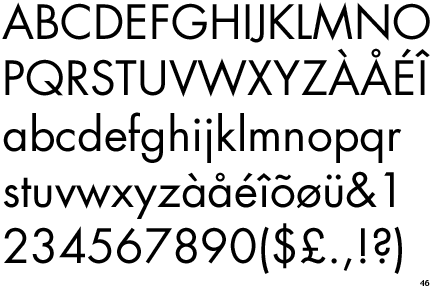
Web designers, understandably, cannot overstate how big of a deal this is.
“It's like the 'Wizard of Oz' moment when they go from black and white to color,” said Tal Leming, a typeface designer. “It's going to be huge. It's going to be absolutely huge.” (via)
23 March 2010
i...didn't know you could do that.

Some linguists believe that @ dates back to the sixth or seventh century, a ligature meant to fuse the Latin preposition ad—meaning “at”, “to,” or “toward”—into a unique pen stroke. The symbol persisted in sixteenth-century Venetian trade, where it was used to mean amphora, a standard-size terracotta vessel employed by merchants, which had become a unit of measure. Interestingly, the current Spanish word for @, arroba, also indicates a unit of measure.
The @ symbol was known as the ‘”commercial ‘a’” when it appeared on the keyboard of the American Underwood typewriter in 1885, and it was defined as such, for the first time, in the American Dictionary of Printing & Bookmaking in 1894. From this point on the symbol itself was standardized both stylistically and in its application, and it appeared in the original 1963 ASCII (American Standard Code for Information Interchange) list of computer codes. At the time @ was explained as an abbreviation for the word “at” or for the phrase “at the rate of,” mainly used in accounting and commercial invoices. (via)
kewl! brb attempting to sell the winking frown to MoMA. ;(
22 March 2010
iphone typography

*hat you think you can just leave out the "*" because it just *on't *ork? *hy don't you just flip over the "M" dum dum.
18 March 2010
24 January 2010
rip bob noorda

06 January 2010
what type are you?
Since 1974, the design studio Pentagram has come up with a special way to usher in the holiday season, sending a select group of friends, colleagues and clients small booklets with an emphasis on strong graphic design rather than pat holiday greetings. But we kinda think they outdid themselves with 2009’s edition, the charming and incredibly well-executed and interactive What Type Are You? Typeface, that is! After entering your name and password—happily, we are allowed to reveal here that it is “character”—turn your speakers, as directed, up. A nattily dressed man, seen only from the neck down, goes into therapy mode, speaking in what we’re imagining is a Freud-like accent. He’ll ask you four simple questions, pausing and fidgeting impatiently if you take too long, and will reveal your own individual “type.” There are 16 different possibilities (from Archer Hairline to Universal), and you’ll receive a short and fascinating history lesson on the specified font. Talk about a gift that keeps giving..
i am dot matrix... but it is possible if i wasnt currently experiencing an emotional breakdown i may have answered differently. i am a gemini after all.
29 November 2009

10 November 2009

21 September 2009


11 September 2009
08 September 2009
NYT on ikea font change / mistake

They should have first taken everything out of the carton and made sure nothing was missing and that they weren’t mixing up, say, a Bjursta with a Leksvik or a Muddus. Then they should have taken a look to see how it all would fit together (serifs, strokes and counters), and only then should they have taken the many parts (stems, extenders, legs, spurs and chins) and started to jostle them into place, making sure they had enough help for heavy lifting when anything resembling pressed board was involved.
Instead they violated their aesthetic and their method: they went cheap (O.K., that’s part of Ikea’s appeal) but they also went pre-fab, ready-made. They even jettisoned their own distinctive, Swedish-owned design for something generic, multinational and bland. What good is designing furniture with coy names few outside your country can properly pronounce if you print a catalog describing those items using a font designed by Microsoft? (via)
Subscribe to:
Posts (Atom)